See Our Latest Blogs
Your go-to resource for marketing expertise
What Small Businesses Can Learn from Iconic Logos
Inspired by Episode 28 of The Marketing Factory Podcast with Marissa Candy
What do McDonald’s, Apple, and Nike have in common?
Besides being global icons, they all have logos that do more than look good, they trigger emotion, build trust, and quietly influence buying behaviour. But here’s the kicker: their logos didn’t start that way.
Do you remember Apple’s original logo? The detailed sketch of Isaac Newton under a tree was not exactly the sleek, bite-marked apple we know today.
In Episode 28 of The Marketing Factory Podcast, founder and award-winning marketer Marissa Candy breaks down what most small business owners miss: “Logos aren’t just designs. They’re strategic weapons.”
Let’s unpack that.
Logos: Your Brand’s Secret Salesperson
Here’s the big mistake: too many businesses approach logo design as an aesthetic decision. “Just make it look nice”. But that’s not what successful brands do. They embed strategy, psychology, and storytelling into every colour, curve, and symbol.
Hidden Symbols & Clever Design Psychology
Let’s look at unpacking some of the most famous logos that use hidden meaning to reinforce their message:
FedEx: See the arrow between the E and X? Speed and precision.
Amazon: That smile? It also points from A to Z, cleverly saying “we sell everything.”
Toblerone: Spot the bear in the mountain, honouring the brand’s Swiss roots.
Toyota: Believe it or not, every letter in “Toyota” is embedded in their logo.
These aren’t happy accidents. They’re intentional choices that build recognition, trust, and loyalty.
Colour and Shape: The Psychology of Great Branding
Your logo isn’t just art, it’s psychology. Different colours and shapes trigger specific emotions, and the big brands know how to tap into this.
Colour Psychology in Branding:
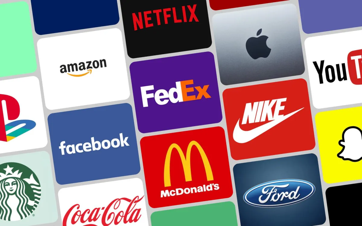
Red (Coca-Cola, Netflix): Excitement, passion, urgency
Blue (Facebook, Samsung): Trust, calm, reliability
Yellow (McDonald’s, Snapchat): Optimism, energy, youthfulness
Green (The Marketing Factory, Whole Foods): Growth, health, sustainability
Black (Nike, Apple): Power, luxury, sophistication
Logo Shapes That Say More Than You Think:
Circles (Starbucks, Mastercard): Community, inclusivity
Squares (Microsoft, BBC): Reliability, structure
Triangles (Adidas, Mitsubishi): Innovation, motion, direction
Your logo is your brand’s uniform. What does yours say about you?
5 Logo Design Strategies from The Marketing Factory
Our logos don’t just look great. They spark emotion, earn trust, and sell. Here’s how.
1. Keep It Simple
Clean, clear logos are easier to recognise and remember. Think Apple, not abstract art.
2. Choose Colours With Intention
Pick colours based on the emotions you want your audience to feel, not just your favourite hue.
3. Embed Hidden Meaning
Smart, subtle symbols make logos more memorable and often spark curiosity.
4. Prioritise Versatility
Your logo needs to work on everything from websites to business cards to tiny app icons.
5. Don’t Fear Evolution
Even Nike and Apple have refreshed their logos. A rebrand isn’t failure, it’s growth.
Your Logo Is an Investment, Not Just a Design
The iconic Nike Swoosh was designed by a university student for just $35. Today, it’s worth billions.
It’s not what you spend but it’s what you embed. If your logo isn’t pulling its weight or you’re not sure if it is, it might be time to think beyond “pretty.” We’ve helped hundreds of businesses create brand identities that actually do something. Want in?
Book a FREE Discovery Call with Our Team and let’s make your brand Bold!
Tune Into The Marketing Factory Podcast
Discover the secrets behind some of the world’s most recognisable logos and how to apply those insights to your own brand. Listen now on Spotify, Apple Podcasts, or YouTube. Follow us on Instagram @TheMarketingFactoryAUS.


Head Office (Brisbane)
Level One, 88 Tribune Street
South Brisbane QLD 4101
0434 520 902
COMPANY
CUSTOMER CARE
LEGAL
FOLLOW US
© 2026 The Marketing Factory - All Rights Reserved.